“An artist cannot fail; it is a success to be one.”
Charles Horton Cooley
A Journey Through My School Portfolio
As I have been a student most of my life, most of my art is the result of an art class assignment. I won’t include everything because I have hundreds of photos from when I took Digital Photography. But here I have a few projects that I am proud of, that hopefully convey a sense of my style (which is still evolving all the time).
Album Cover Design
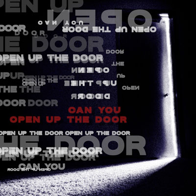
I designed this album cover in my Photoshop & Illustrator course. It is based off of the song “CHIHIRO” by Billie Eilish, where in the chorus she repeats the phrase “open up the door.” I first took a photo of a door in my basement, then edited it so it was grainier and tinted blue. In Photoshop, I added the typography. This was a really fun project, although if I knew better how to use Photoshop, I would have added more of a glitch or blur effect to the words. Maybe in the future I can rework it.
Logo Designs
I designed this logo and the one to its right in my Photoshop & Illustrator course as well. It features the three initials of my name, Julia G. Janning. I used some of my favorite colors; sage green paired with beige or cream. My teacher actually liked it so much she wanted to use it as an example in that assignment for future classes.
I don’t think this one is as legible, but it’s still interesting. The font I chose does make it hard to read the letters, though. However, the assignment only required us to make one monogram logo with our initials, so I only made this second logo because I had extra time and was practicing using Illustrator.
Pin/Button Design
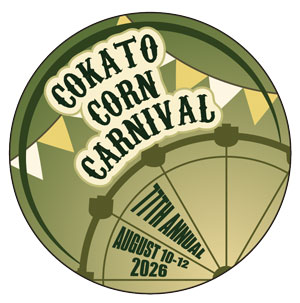
I designed this button in my Photoshop & Illustrator class too. This is for a real carnival in Cokato that happens every year, and my class last Spring designed potential buttons for the event. Mine didn’t get picked, but if you search “Cokato Corn Carnival 2026,” my classmate’s button design is at the bottom of the page!! Even though it wasn’t chosen, designing this was a blast. I originally planned out a red and white color scheme, because that fits the carnival aesthetic in my mind. But as I experimented, this seemed to suit the button better.
Drawing Final
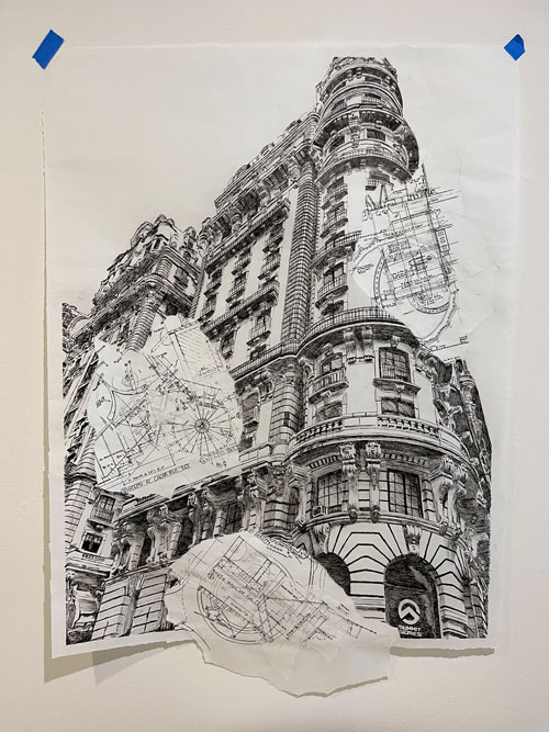
This project is my favorite and I love looking at it (I really love architecture). I made this for my drawing class. Since it’s kind of hard to see the scale in this picture, this is the size of three by three papers taped together. The building is a condominium – formerly a hotel – in New York, called the Ansonia. I sketched the outside of the hotel, then took these very thin papers I had traced blueprints on, and glued them to the paper with the hotel sketch. I was able to get real blueprints for a building in my town from a contractor. All of this was done with micron pens on very thin, see-through paper so that you can see the layers of blueprints I added. It’s tricky to see because it’s blurry here, but there are several layers of them, and the details are super teeny-tiny.
Photography Series


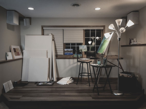
This assignment for my Digital Photography class was to create a series of five images that are connected through a theme. The theme I chose was a room. I turned this nook in my basement into a library, a photography studio, an at-home gym, a music room, and an art studio. I remember paying attention to every detail, even the time of day, so that each image would be unique. Looking back, it’s kind of impressive I did all of this by myself because there was so much moving of heavy things and furniture. That bike was a massive pain. And those bookshelves are heavier than you think. But I hope that puts into perspective how much work I’m willing to put into a project.